A New Look for The National Ballet of Canada
By Caroline Dickie
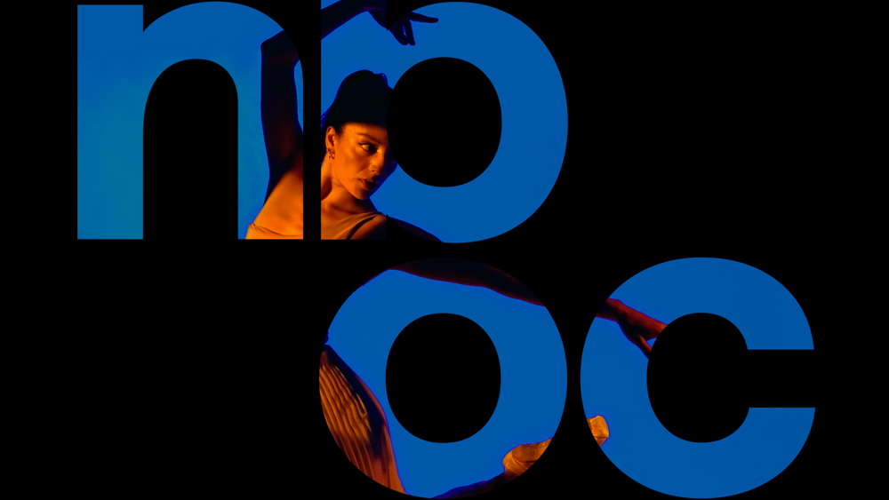
The National Ballet of Canada is embracing an exciting new era with a visual identity that reflects everything the company stands for today. Dubbed “The Storyteller,” the rebrand is inviting and contemporary with a spirit of creativity that reflects Hope Muir’s aspirations as Artistic Director and the energy of the entire company in this unique time of growth.
“The brand isn’t just a logo,” Hope said. “It’s a philosophy that has to represent our company and culture, our value system and how we want to move forward as a classical ballet company. We haven’t changed to the point of being unrecognizable. But we have changed in terms of our repertoire, the diversity of our collaborators and our accessibility to a wider audience. The new brand reflects that. There’s space for people to ask questions and engage with us in a way that we need to be listening to right now, in 2024.”
“It was imperative that the new identity should move. Motion and video elements figure prominently.”
Belinda Bale, Director of Marketing and Communications, guided the rebrand in consultation with Hope and Toronto’s Bruce Mau Design (BMD), reimagining everything from the logo to the website, colour palette and approach to photography and storytelling.
“It has been nearly 20 years since the National Ballet last rebranded and it was the right time to revisit our visual identity,” Belinda said. “We wanted to create a brand that reflects who the company is today, but also where we want to go in the future. The rebrand is a new way for the company to share our stories and invite audiences, both existing and new, to engage with us in a more meaningful way. The project has been a wonderful collaboration and the results reflect the many people who contributed their voices, letting us know what The National Ballet of Canada means to them.”
The storyteller concept and wordmark are the centrepiece of the new brand and include creative taglines that speak directly to audiences. For example, when the wordmark asks, “what you would do for love?” we are invited to think about ballet in a new way. The company becomes the protagonist in its own stories, bringing the performance dynamic right into the branding.
Laura Stein, Chief Creative Officer at BMD, explained: “There’s always a verb that tells you what the National Ballet is doing and invites you in. That becomes a modular structure for all sorts of different stories. It reinforces that it’s not just one person creating these incredible performances. It’s an entire company that’s inviting you in.”
“The new look is bold and brave.”
Art Director Carmen Wagner, who has been a key liaison with BMD, envisions the new brand improving access to dance. “It’s exciting to think about the future possibilities for the company and how we can tell our stories in an engaging and fresh way – perhaps encouraging a new audience to experience what we’ve all had the privilege of putting on stage year after year. That was one of our main goals – to be inviting and creative and break down some of those barriers to entry.”
Since the National Ballet is a dance company, it was imperative that the new identity should move. Motion and video elements figure prominently in this new brand and even the spacing within the wordmark conveys a sense openness and movement. Combined with saturated colours of orange, green and blue, the effect is distinct yet unexpected.
“A colour like pale pink is totally in the pocket of what we might think of as a traditional ballet company,” said Laura. “Changing it to these jewel-toned, punchy colours makes you look at it again and rethink what you thought you knew.”
If the brand could be distilled to a single word, it would be “bold.” Laura and the BMD team heard it repeatedly in their conversations with company members and stakeholders eager to capture the momentum of the National Ballet today.
“The brand isn’t just a logo, it’s a philosophy.”
“A lot of people say they want to be bold, but I think we really nailed it,” said Hope. “The new look is bold and brave, and it sets the tone for who we are. We’re providing access and we’re providing a diverse repertoire. It’s just such an exciting moment to be here.”
Top Photo: Selene Guerrero-Trujillo. Photo by Karolina Kuras.
